Customize Promodag Reports charts
A Style Editor has been available in the Tools menu for some time now and was the subject of a previous post. However, curve, histogram and pie charts were delivered with a single color palette until version 14.0.0091, with no change possible. It is now possible to choose from over fifty different pre-composed chart palettes to enhance the appearance of reports.
The Chart Palette option
To access the choice of chart palettes, go to Tools > Style Editor and open the drop-down list next to the Chart palette option.
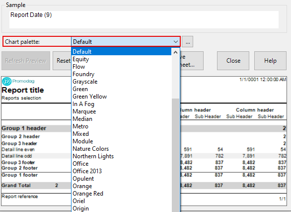
Each pre-composed palette is defined by a short, more or less evocative name. You can preview the palette colors by clicking on the ... button.
A few examples
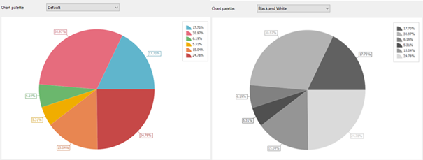
Default and Black & White
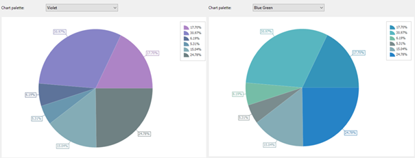
Violet and Blue Green
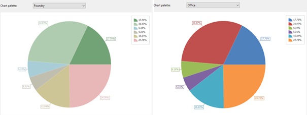
Foundry and Office
Combine chart palette and style sheet
You can now create a new style sheet to your liking or modify one of those supplied with Promodag Reports by associating a graphic palette consistent with the styles it contains.
Here, for example, is a report using the Blue style sheet in conjunction with the Blue Warm palette.
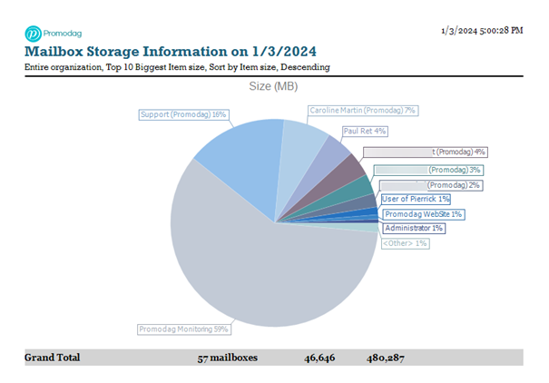
To achieve this, load the Blue style sheet into the style editor, select the Blue Warm palette from the drop-down list and save the style sheet. Then set it in the Reports tab of Tools > Options. Now you're done.
Conclusion
This minor change is in line with the development of report appearance customization features since version 10. You can try it out in trial mode if you're not yet a customer or use it in production to enhance your reports. Visit our Downloads page to obtain the latest version of Promodag Reports and use our Contact form if you have any commercial or technical questions.
Comprehensive Exchange reporting made simple for Office 365, On-Premise, and Hybrid environments
Start your free 45-day trial of Promodag Reports
